Graphing descriptive statistics
There are many ways of displaying data and the method used may depend on the nature of the data. Below are a few more common examples. Box-and-whisker diagrams The box-and-whisker diagram is a useful way to represent a large amount of information about a set of data (Clarke, 1994). To draw this diagram, it is necessary to have certain information about the data:
Example. Imagine that you are measuring the food intake at each feeding time for two populations of domestic cats, collecting the following data:
Population A:
Population B:
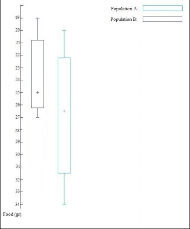
Graphic representation of the data sets shown in the example, using a box-and-whisker diagram. The extremes of the boxes represent the quartiles, the whiskers are the maximum and minimum values and the cross is the median of each set of data.
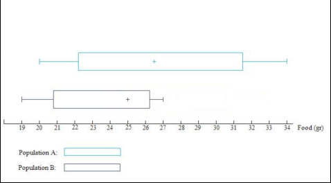
The same graph can also be presented in a horizontal format, giving exactly the same information. As can be seen from the figure, box-and-whisker diagrams are very useful to compare sets of data before further analyses are performed as they provide a visual representation which allows the user to get a “feel” or “idea” or what their data looks like (note that data must conform to the same scale) (Clarke, 1994). For example, it can be seen very quickly and clearly, that on average Population A ate slightly more food (26.5 versus 26grams of food). One can also see the level of spread of the data (i.e. the range of scores across the individuals for each population) which can be summarised using the inter-quartile range. For example in the two populations of cats, the medians are very similar (26.5 grams for the population A and 25 grams for the population B), but the data of the population A are much more spread out than those of the population B; indeed the inter-quartile range for population A is 9.25, while the inter-quartile range for the population B is 5.5. Thus there was much more variation in how much food was eaten in population A in comparison with population B.
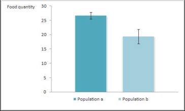
Another graphical representation of the same example: the bar chart with standard error bars. Considering that the data are parametric, this kind of graph is the most appropriate.
|
|||||||||||||||||||||||||||||||||||

Compiled by:
Dr Sarah Ellis and Dr Helen Zulch